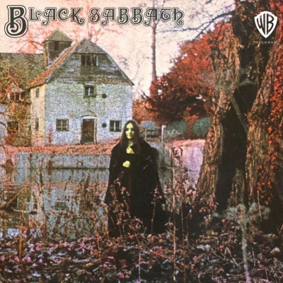
The name of the Black Sabbath font that is used on the cover of their debut album is a typeface by the name of Black Sabbath 70. As the name of the font suggests, it reflects the year that this self-titled album was released in 1970.
There have been several different fonts used across each of the 19 studio albums released by the legendary Black Sabbath. Below we present a discography of these albums along with depictions of the official band logos and TTF fonts used for each:
Black Sabbath
Their first studio album, and was released on 13 February 1970. The font used on this album is perhaps the most widely recognised of all Black Sabbath logo lettering. The album reached a peak of #8 on the Music Charts in Australia, Germany, and the United Kingdom. The font that was used to create the logo for this album is called Black Sabbath 70. The design of this typeface is based on a font called Manuscript Captials by the Letraset corporation.
The Black Sabbath 70 typeface comes with a Freeware license, which means that you are free to use it for all personal uses. It is presented as in a True Type Font (TTF) format thereby making it fully compatible with all PC and Mac computers. Click here or on the Download link below to get yourself a free copy.
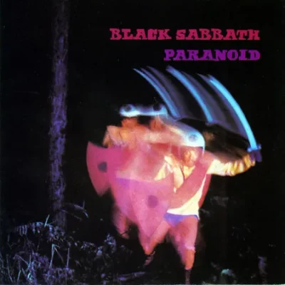
Paranoid
Their next album was released on 18 September in 1970. This was a quick follow-up to their debut album – ie. only 7 months later. This album was very popular and went to #1 in the UK and Netherlands. It was also popular in Germany (32), and Finland and Australia (#4 for both countries). The font used on this album cover was a hand-drawn logo, and was created by a personal friend of one of the band members.
Sabbath Paranoid is the name of a freeware font created by a font author known as Toto. This free typeface includes Uppercase and Numeric characters. It is a near exact replica of the original logo design used on Black Sabbath ‘Paranoid’ album cover.
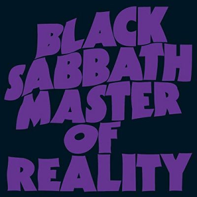
Master of Reality
Their next studio album was title Master Of Reality and was also released soon after the previous album – on 21 July 1971. The font used on the cover for this album was a block sans-serif font with a distinctive wave to it. The album was released on 21 July 1971. The typeface had a wavy, altered-reality look to it which was synonomous with the pyschelic times of the 1970’s. ITC Kabel Ultra is the name of the font that most closely resembles the one used on the Master Of Reality album cover. The original version of this typeface was created by Rudolf Koch during the mid-1970’s, and was later updated and released as a second version by Victor Caruso (a well-known font designer of the time). Some people claim that this is a modified version of the Futura Extra Bold font – make your own mind up on that one!
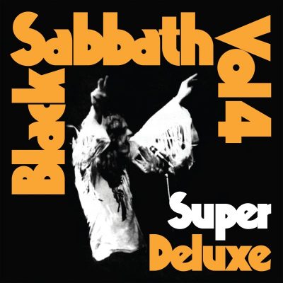
Black Sabbath Vol 4
A year later on 25 September 1972, along came their Vol. 4 album. This was hugely popular in Australia going to #1 there. The font used on this album cover used a distinct Display typeface with fat, chunky characters and angular accents. The name of the font that is claimed for this particular album is a typeface by the name of Baltar – athough this seems to be a contentious topic and open for discussion.
Sabbath Bloody Sabbath
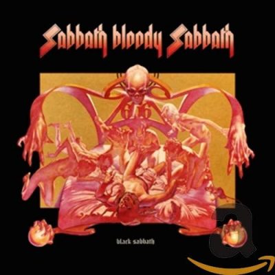
Their fifth ablum was released in November of 1973, with the font on this particular album cover depicting a more classical hard-rock / metal look and feel. It was a font style that many other heavy metal bands would copy over the coming years (very similar to the one used by Spinal Tap). The band name at the bottom of the front cover is written in a commercial font by the name of Old English Text. There is a freeware clone that you can download free of charge here called Cloister Black. It was designed and created by a fan of the band called Dieter Steffmann.
Sabotage
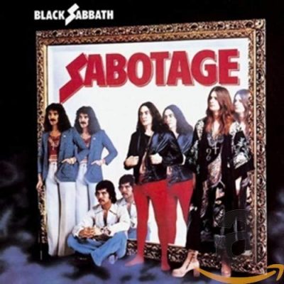
Their next album was called Sabotage and was released back on July of 1975. The font used on this album was a Sans-Serif font called Futura Extra Bold Condensed and was actually quite plain in appearance – except for the capital “S” letter which had more of traditional hard-rock look to it (and also the same “S” as was used on the previous album cover).
Technical Ecstasy
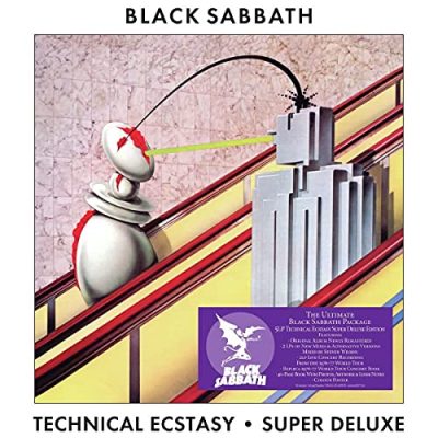
The font used on this Black Sabbath album was perhaps the most basic of all of their albums. It features Futura Medium, a clean and easily readible typeface that was appropriate for this Greatest Hits type album released to the public in September of 1978.
Never Say Die
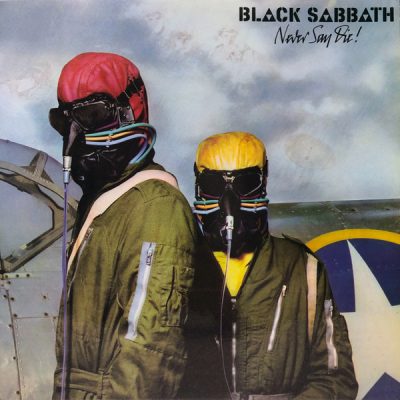
This album from September 1978 saw Black Sabbath use a Stencil type font style for the first time on what of their album covers. They mixed up the font and made it their own by adding an inverted triangle to the “A” characters in the logo lettering.
Other Black Sabbath albums include:
- Heaven and Hell – 1980
- Mob Rules – 1981
- Born Again – 1983
- Seventh Star – 1986
- The Eternal Idol – 1987
- Headless Cross – 1989
- Tyr – 1990
- Dehumanizer – 1995
- 13 – 2013
About the Black Sabbath typeface
Black Sabbath was an English rock band founded in 1968 in Birmingham by Tony Iommi, Geezer Butler, Bill Ward, and of course, Ozzy Osbourne. The band helped define a generation. With their heavy rock music and their outlandish appearance, Black Sabbath had people divided, those who loved them and those who thought their music was dangerous and corrupted young minds. But as the saying goes, all publicity is good publicity, and the band saw major success worldwide. Songs such as Paranoid, Children of the Grave, and War Pigs became monster hits, fans just couldn’t get enough of the Black Sabbath craze!
No band is complete without its own style, and Black Sabbath certainly had a unique style. This style even made its way onto the Black Sabbath font. This wavy retro typeface is synonymous with the English metal band. One other thing that is synonymous with Black Sabbath is controversy! The band has done some bizarre things over the years. From their strong lyrics to Ozzy Osbourne biting the head off of a bat on stage, the band has made headlines several times due to their actions. Needless to say, there isn’t much that the band wouldn’t do! Although they are no longer together as a band, their music is still incredibly popular to this day.
The post Black Sabbath font appeared first on Action Fonts.